


As with all major social networks, the LinkedIn logo is now entrenched in popular culture . It must be said that Microsoft’s social network now has just over 310 million monthly active users, which exposes the various elements of its graphic charter to an impressive audience.
In this article, Leadin.fr offers you to download the different versions of the LinkedIn logo in high definition. We also invite you to come back to the history of the visual identity of the professional social network. As you will be able to see, LinkedIn has chosen to play the card of stability and sobriety. Let’s go !
Once upon a time… the LinkedIn logo!
The first version of the LinkedIn logo was born in the early 2000s , a few months before the actual launch of the professional social network on May 5, 2003. Contrary to what one might think, the LinkedIn logo remained relatively confidential in 2003, insofar as the social network ended the year with less than 250 users, and the majority of them were simply acquaintances. of the two founders Reid Hoffman and Eric Ly.
The LinkedIn logo gradually gained visibility in 2004 , as the professional social network attracted American business leaders (mainly SMEs). Thus, its audience has grown from a few hundred to several hundred thousand users less than two years after the site was put online.
If LinkedIn had a booming 2010 decade, its visual identity remained relatively stable , as we will see in the next section. Indeed, the LinkedIn logo remained the same between 2003 and 2011. A very slight facelift was carried out on the visual identity of the social network in May 2011 on the occasion of the entry of the company on the New York Stock Exchange.
For the record, the top management had pulled out all the stops to prepare for this event. In addition to some minor changes to the professional social network’s graphic charter, the leaders also reviewed the underlying infrastructure of the website to improve the user experience. The strategy paid off, as LinkedIn stock gained 109% of its value on day one of the company’s IPO.
In 2011, LinkedIn generated $154.6 million in ad revenue, allowing itself the luxury of overtaking Twitter. It is doubtless from this period that the “minified” logo of LinkedIn, consisting of the syllable “in”, gained notoriety. LinkedIn then entered the very closed club of brands recognizable by the mere sight of a logo without explicit registration.
The 2010 decade did not see any upheaval in LinkedIn’s visual identity. The logo underwent a further facelift in 2019, and the premium logo was developed to accompany the launch of the professional social network’s paid offers. However, LinkedIn has enriched its graphic charter to include more colors to get rid of the “all blue” (All blue), reflect an image of inclusion and diversity and humanize its image. So that’s it for the little flashback! To go further, we suggest you analyze each version of the LinkedIn logo with its subtleties, nuances and symbolism.
The LinkedIn logo from 2003 to 2011: a graphic base that will hardly change anymore
Facebook ? Blue and white. Twitter? Blue and white. LinkedIn? Blue, black and white. Why major social networks, at least those that emerged in the 2000s, have all made blue the dominant color of their visual identity?
Of these three social networks, LinkedIn is undoubtedly the brand that corresponds most closely to blue, a color that symbolizes professionalism, sobriety and seriousness… elements that describe well the value proposition of the social network. This is why political parties, continuous news channels and even the costumes of politicians use this color. The original LinkedIn logo is tricolor. Although blue is not the color with the most pixels, it is the one that stands out the most (the other two “colors” being black and white).
At its launch, the LinkedIn logo is therefore composed of the following elements:
⦁ The word “Linked”, which means “Lié”, “Uni” or “Joint” in French. This term is in black with bold lettering. The first letter is capitalized, which contrasts with the fashion of the time which consisted in stylizing the names of the brands by putting all the letters in lowercase or in uppercase. The font used was obviously an original design, even though it looked blatantly similar to the fonts “Radiate Sans Bold” and “LCT Picon Bold”;
⦁ The syllable “in”, written in the same font as the word “Linked”, this time in lowercase. Interesting fact: in writing, the word “LinkedIn” was stylized with a capital “i” in the syllable “in”… a form that is not found in the logo. This white syllable was highlighted by a blue box, bringing to the logo this aura of seriousness, professionalism and reliability.
Interesting fact: LinkedIn blue has its own name, “LinkedIn Blue”, with the hexadecimal code #0077B5 (or 0% red, 44.71% green and 69.41% blue depending on the RGB model). Also, it is difficult not to see the inspiration of the logo of PayPal, a company which had a certain Reid Hoffman (founder of LinkedIn) in its management team.
The LinkedIn logo from 2011 to 2019: a barely noticeable change
As a rule, the logos of brands that experience meteoric rise are quickly reworked. The least that can be said is that LinkedIn’s management team has shown exceptional stylistic consistency since the launch of the professional social network.
Some will even mention a certain unprecedented “conservatism” in a sector of activity rather focused on rapid development and adaptation to trends. Eight years after the very first logo, the founders chose to carry out a small facelift on the visual identity of the professional social network on the occasion of the IPO of the company LinkedIn Corporation.
This change went unnoticed, and for good reason: the font and colors remained the same. The letters have simply been (slightly) widened by 3 millimeters to “make the logo more readable”, can we read in the terse statement that accompanied this small change.
Another minor modification : the lower part of the letter “e” of the word “Linked” was slightly shortened and rounded to “bring a little more personality to the logo”. Don’t worry: if you don’t see a difference between the first and the second logo, you’re not alone. Even today, some specialized press titles consider that LinkedIn had the same logo between 2003 and 2019!
Interesting fact : In June 2016, Microsoft announced the acquisition of LinkedIn for $196 per share, or a total value of $26.2 billion. This is the second largest acquisition made by the Redmond firm to date. No changes were made to the LinkedIn logo despite this major event in its history.
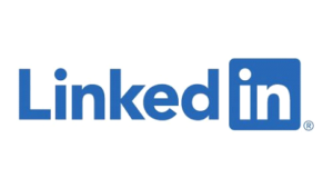
The LinkedIn logo from 2019 to today: even more blue!
It wasn’t until 2019, more than 16 years after LinkedIn’s launch, that the logo saw its color scheme change. As you can imagine, the management team has once again chosen to play the card of sobriety by eliminating black from the color palette to replace it with the same shade of blue found in the box. Today, the LinkedIn logo is even more refined than the original version, since it only has two colors: blue and white.
This recoloration is probably the first major change to the LinkedIn logo since the launch of the professional social network. This modification was accompanied by some minor retouching:
⦁ The font has been very slightly refined;
⦁ The dots above the letter “i” (which appears twice in the LinkedIn logo) have been moved slightly away from the letter bar;
⦁ The Trademark symbol “®”, signifying that the trademark has been registered, now appears at the end of the logo, in the lower right part.
This facelift of the LinkedIn logo seems decorrelated from the news of the company, insofar as the year 2019 did not see any major event for Microsoft’s social network. The only interesting news that year was the global launch of the Open for Business and LinkedIn Events features as well as the acquisition of the marketing solutions company Drawbridge by LinkedIn.
The point on the variations of the LinkedIn logo
Alongside the main logo, LinkedIn has a few variations for its premium offer, but also for configurations that require a logo in a square format.
The LinkedIn Premium logo
To accompany the launch of its paid offers, LinkedIn has developed a “premium” version of its logo. Again, no revolution in sight. The blue color has simply been replaced with a gradient “gold” color, with a darkening from top to bottom. This logo is displayed to subscribers of Sales Navigator, Recruiter Lite, etc.
Note: if you are a premium member, you can choose to display the gold logo on your profile to indicate your status. To activate this badge, click on your profile picture icon in the top left corner of the LinkedIn homepage. Then click on your profile picture, then click on “Edit”. In the pop-up window, click the “Edit” icon at the top left. Choose “Premium profile badge”, then click “Save”.

The shortened LinkedIn logo
Some configurations require a smaller logo size, or a square logo rather than a rectangular one. In this case, LinkedIn offers a truncated logo that only has the blue box with the inscription “in” in white. This version is sometimes called “in logo”.

LinkedIn’s black and white logo
Some configurations, especially when the background of the publication document is blue, require a logo with a different background for obvious reasons of visibility and readability. This is why LinkedIn also offers a logo where blue is replaced by black. This version of the logo can also be used on black and white documents.
LinkedIn’s new visual identity
Let’s zoom out of the logo for a moment to analyze the other elements of LinkedIn’s current graphic charter. “While internally we know our brand is warm and inclusive, we may not have expressed it that way externally,” reads LinkedIn’s visual identity page. This is why the brand has made certain changes to its graphic charter and its editorial line to reflect this image:
⦁ A friendly tone without lapsing into familiarity;
⦁ Photos centered on the human, most often showing a group of professionals in full exchange;
⦁ Warm illustrations, most often with bright colors;
⦁ A warmer and more accessible color palette (excluding logo). “Blue now complements the palette instead of dominating it,” reads LinkedIn’s visual identity page;
⦁ The basic shapes of the mark are now the circle and the rectangle;
⦁ LinkedIn’s new custom font has been named ‘Community’. It incorporates elements of handwriting and rounded, more organic letters.
The official LinkedIn logo datasheet
Here are the different blue references of the current LinkedIn logo:
⦁ HEX: #0077B5;
⦁ RGB: (10, 102, 194);
⦁ CMYK: (87, 62, 0, 0);
⦁ PANTONE: PMS 7455 C.
Here are the references of the white of the LinkedIn logo:
⦁ HEX: #FFFFFF ;
⦁ RGB: (255, 255, 255);
⦁ CMYK: (0, 0, 0, 0).
Here are the brands that use a graphic charter similar to that of the LinkedIn logo:
⦁ Skype;
⦁ DigiByte;
⦁ Crucial;
⦁ PayPal;
⦁ Twitter.
The LinkedIn logo on your CV
LinkedIn is now an inseparable part of your employability. Indeed, your profile on this professional social network is essential today as a relevant complement to your CV and possibly to your cover letter.
On a digital CV, we will place the shortened LinkedIn logo, the famous “in logo”, at the top with a link that will redirect the recruiter to your LinkedIn profile. He will then be able to explore your professional experiences, your training and your publications. They will also be able to inquire about professional relationships you may have in common and possibly see the skills that have been recommended by your peers.
On a paper resume, you’ll need to add your LinkedIn profile URL to the logo for obvious reasons. More broadly, see your LinkedIn profile as an additional space to demonstrate your skills and soft-skills in addition to your CV. If you’re not sure how to get your LinkedIn profile URL, here’s how:
⦁ Click on your profile icon on the top left of the LinkedIn homepage;
⦁ Click on “View profile”;
⦁ From your LinkedIn profile, click on “Edit public profile and URL” on the right side;
⦁ In the “Edit URL” tab, locate the URL of your LinkedIn public profile and copy and paste the link on your CV before printing.
Note: the URL only appears if your LinkedIn profile is public.
Use the LinkedIn logo in a professional context
LinkedIn’s trademarks and other brand features are protected by law. If you wish to use the LinkedIn logo in a commercial context, you must submit a request for authorization to the email address TrademarkRequest@linkedin.com. Here are some guidelines from LinkedIn branding:
⦁ In commercial use, the name “LinkedIn” must be accompanied by the symbol “®” or “™”;
⦁ The use of the “in logo” is recommended as an anchor to insert a link to your professional profile or company page. LinkedIn recommends that listings that complement the “in logo” be black;
⦁ Media can use the different LinkedIn logo formats offered ⦁ on this link. No modification of these logos is authorized;
⦁ The “in logo” must always be used in color on the web;
⦁ The minimum size for LinkedIn vector logos is 21 pixels high on screen and 0.25 inches in print applications;
⦁ LinkedIn authorizes the use of the “in logo” on business cards, provided that it is accompanied by the link to your professional profile on the social network.
LinkedIn logo: Leadin.fr disclaimer
This article, its author and the company that manages the domain name leadin.fr are not affiliated with LinkedIn Corporation. The symbols and other elements used to illustrate this article are the trademarks of LinkedIn Corporation. This article is offered to you for the purpose of information and education.
